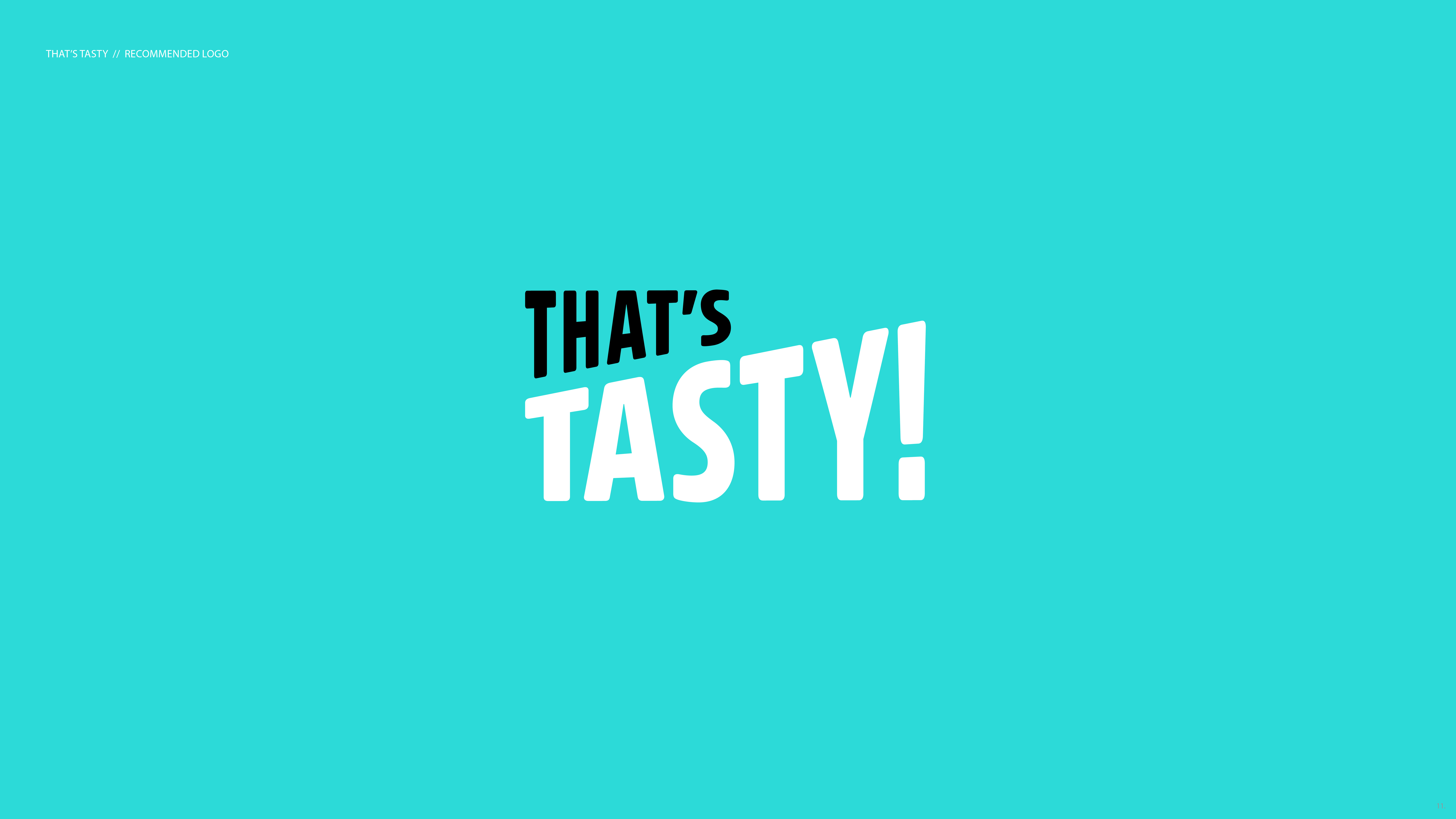
That’s Tasty
Rebrand // Redesign – logo & Packaging // Identity System // Brand lookIndoor grower, That’s Tasty, needed a brand refresh that included everything from positioning, to internal communications, to external branding and a completely new packaging system. The only things that weren’t changing were their name, and the color teal.
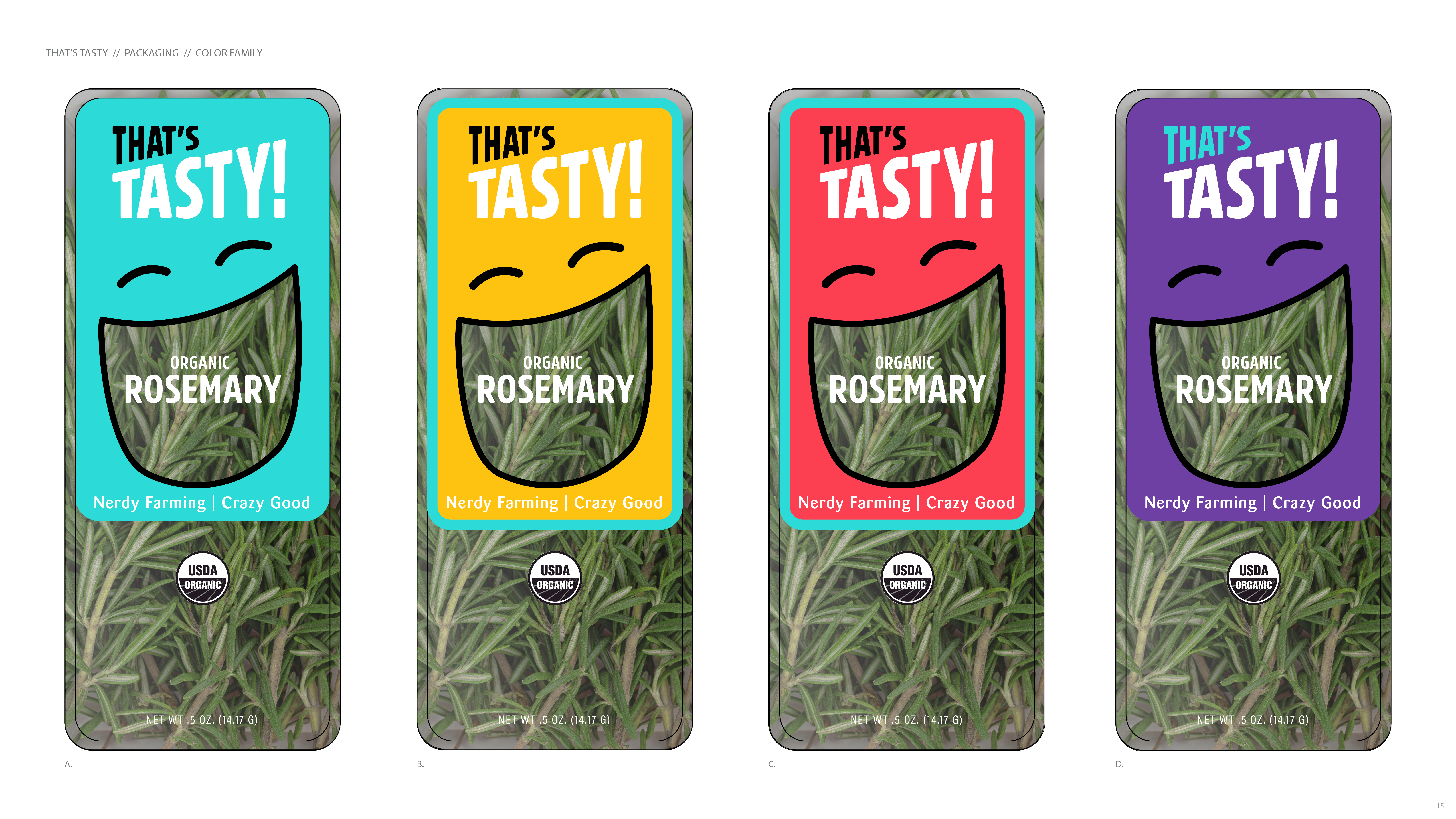
I developed this look to show maximum amount of product while leveraging the excitement of the name, resulting a packaging design system that literally jumped off the shelves.
The character of the face, and the dynamic typography became foundational elements for social and in-store branding communications.